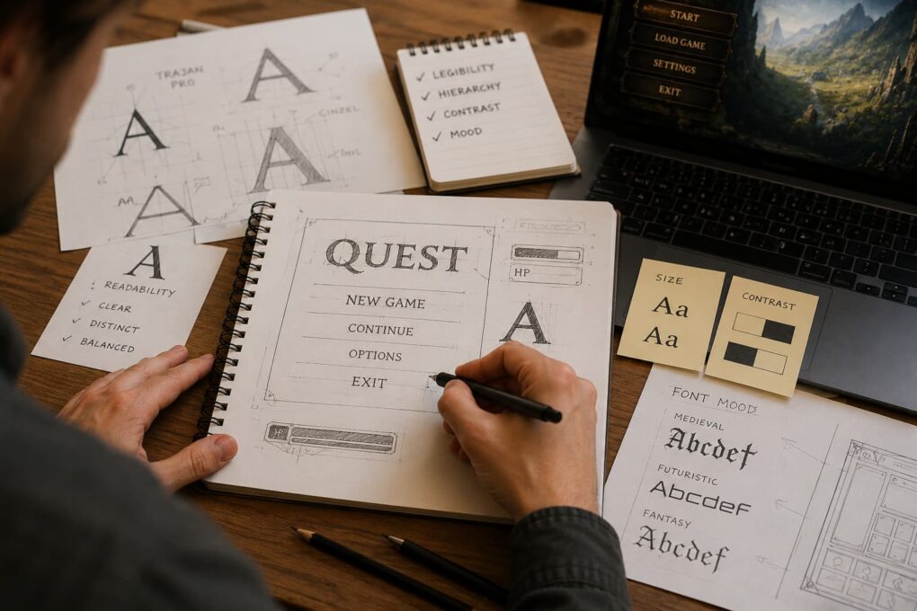
A player rarely thinks about fonts. They look at the world map, at the health bar, at the damage numbers, at the menu items, and all of it feels like something that simply exists. But behind every letter in a game stands a designer’s decision, and those decisions matter far more than they seem to. A poorly chosen font can spoil the impression of a beautiful game, while good typography makes the interface invisible in the best possible sense – it just works, without getting in the way or drawing attention. Text in games is not decoration but a working tool through which the game talks to the person.
The first thing a developer faces is choosing a font that fits the character of the game. A font carries mood before a single word has been read. Heavy blocky letters with sharp corners suit a grim action game, while soft rounded shapes fit a calm puzzle or a project for children. Gothic script instantly evokes the medieval world, and a strict monospaced font creates a sense of machinery and cyberspace. A mistake here is costly: if a cheerful arcade game uses a cold corporate font, the player feels a dissonance without even understanding its cause. Good designers pick a font as carefully as they pick music or a color palette, because all these layers must speak of the same thing.
But mood is only half the task. The other half, and a far more important one, is readability. A game places text in conditions that ordinary typography in a book or on a website never has to deal with. Letters lie over a moving background, over bright explosions and busy textures. A damage number flashes for a fraction of a second and must be read instantly. An item name appears in a cramped inventory cell. All of this forces the choice of fonts with clear, well-distinguished letterforms, where a zero is not confused with the letter o, or a one with a lowercase l. Decorative fonts with flourishes, lovely in a title, turn to mush in combat, and an experienced designer knows where to stop.
A separate headache is screen size. The same game may run on a large monitor and on a small phone, and text that is comfortable on a desktop becomes an unreadable trifle on a smartphone. Mobile games are forced to be especially careful: a larger font, shorter phrases, less text on screen. What fits on one line on a computer has to be broken up or shortened on a phone. That is why interface designers test text on the smallest target device rather than on their own comfortable big screen – otherwise a player with a budget phone ends up with an interface where nothing can be made out.
Contrast between text and background matters just as much. Light letters on a light background, or dark on dark, blend together and force the player to squint. Games solve this in different ways: an outline around the letters, a semi-transparent panel beneath the text, a shadow that separates the words from a busy scene. These tricks are almost unnoticeable, yet they are exactly what keeps numbers and words legible over any chaos on screen. Without such protection the interface falls apart at the very moment the player most needs to read information quickly.
The space around the text plays no smaller role. Letters standing tightly together read heavily, lines that overlap tire the eye. The distance between letters, between words, and between lines is a fine adjustment you notice only when it is done badly. A skilled designer gives the text air, does not squeeze the menu to the limit, and does not stuff the screen with information to the brim. Empty space here is not a loss but a tool: it guides the eye and makes the interface calm.
Text also builds hierarchy. The player should understand at a glance what is primary and what is secondary. A large bold heading immediately draws attention, the regular text below it reads as an explanation, a small caption drops to the third tier. By varying the size and weight of the letters, the designer places accents and leads the person across the screen in the right order. When everything is written the same way, the player gets lost and has to read every line closely, which is irritating and slow.
There is a technical side that beginners tend to forget. A font must support every language the game will ship in. A beautiful set of letters designed only for the Latin alphabet turns out useless once the game starts being translated into Russian, Greek, or Japanese. Then the team either has to find a similar font with the needed characters or hastily rework the whole interface. Experienced studios think about this in advance and choose fonts with a broad character set, so that localization does not become a catastrophe. The same applies to differing word lengths: a short English label can become twice as long in another language and simply not fit on a button if room was not left for it beforehand.
It is also worth remembering those who find reading harder. Some players have weak vision or particular ways of perceiving text, and a good game meets them halfway. The ability to enlarge the font, choose a more legible style, or boost the contrast makes the game more accessible without hindering everyone else. Such settings have stopped being a rarity and are gradually becoming a mark of respect for the audience.
In the end, fonts and text in an interface are work that gets noticed only when it is done badly. Good typography dissolves: the player reads without thinking, finds what they need without effort, and sinks fully into the game. Bad typography yanks them out of the process, makes them squint, get confused, and grow annoyed. That is why serious developers treat letters with the same care as gameplay and graphics. It is through text, after all, that a game explains its rules, tells its story, and hints at what to do next – and if that conversation flows smoothly, it means someone worked very hard to make sure you never noticed.